
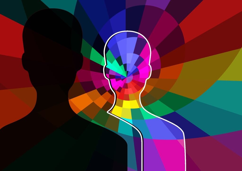
Colour isn’t just about aesthetics—it’s a powerful tool that can shape perceptions, evoke emotions, and influence behaviour. In branding and advertising, understanding the psychology of colour can give your business a competitive edge by creating emotional connections and reinforcing your brand identity.
Why Colour Matters in Branding
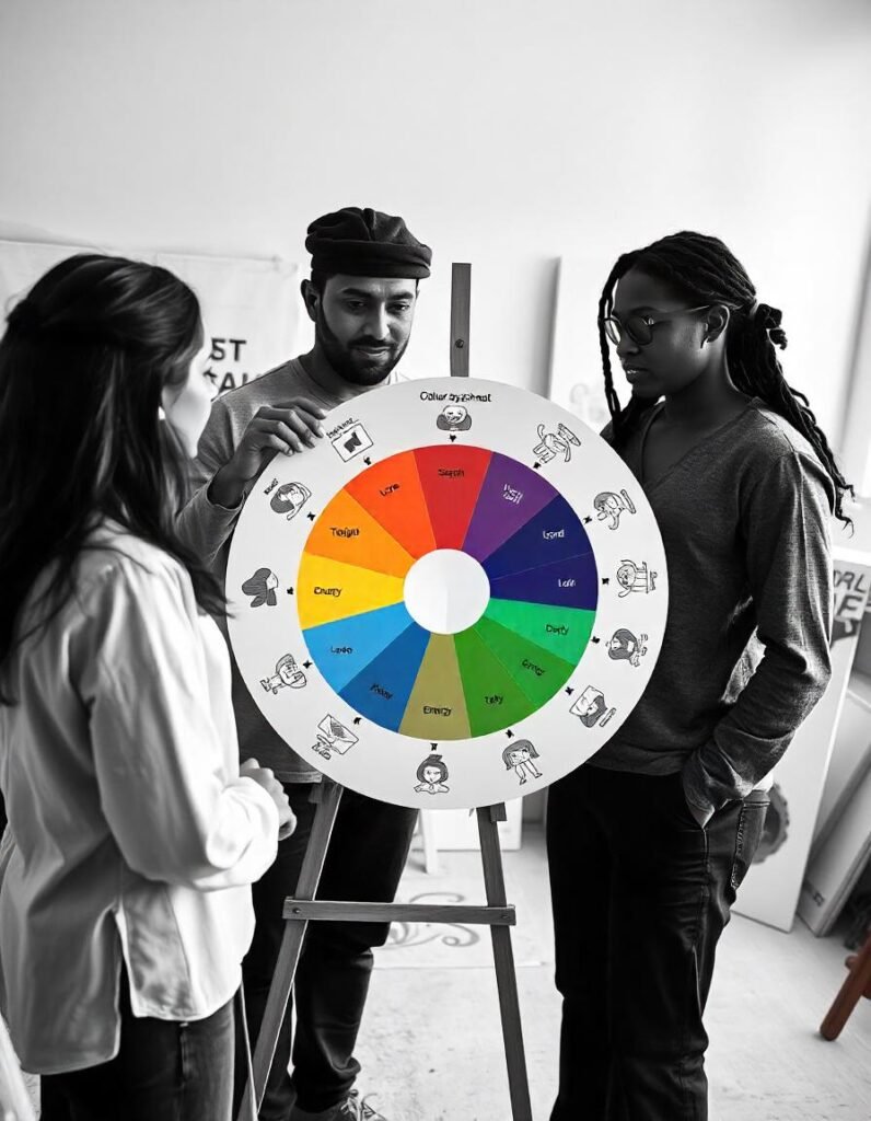
Colours have a profound psychological impact. They evoke specific emotions and associations, making them key to how people perceive your brand. For example:
- Red: Evokes energy, passion, and urgency, making it ideal for brands like Coca-Cola.
- Blue: Suggests trust, stability, and professionalism, as seen with Facebook.
- Green: Represents nature, health, and renewal, often used by eco-conscious brands.
- Yellow: Conveys happiness, energy, and creativity, perfect for playful or youthful brands.
- Purple: Symbolizes luxury, creativity, and elegance, often chosen by premium brands like Cadbury.
By strategically using colours aligned with your brand’s personality and target audience, you can enhance brand recognition and loyalty.
The Role of Colour in Consumer Behaviour
Colour influences buying decisions more than we realize. Studies show that certain hues can:
- Stimulate appetite: Red and orange are popular in the food industry.
- Create urgency: Red is often used in sales promotions.
- Signal quality: Sophisticated hues like purple or gold suggest premium products.
In retail or digital spaces, colours guide attention and evoke specific emotions. For example, warm colours can energize a shopper, while cool tones promote calmness and trust, ideal for healthcare or tech brands.
Applying Colour Psychology in Advertising
Successful ad campaigns often use colours strategically to evoke the desired emotional response. Here’s how:
- Align colours with your message: Green for eco-friendly products or red for urgency in sales.
- Create visual hierarchy: Use bold, contrasting colours to highlight key elements like call-to-action buttons.
- Leverage cultural relevance: Ensure colours resonate with your audience’s cultural and emotional context.
For instance, Tiffany & Co.’s robin’s egg blue conveys exclusivity and elegance, while McDonald’s golden yellow evokes happiness and appetite.
Tips for Using Colour Effectively
- Understand Your Audience: Conduct research to learn how your target demographic responds to different colours.
- Be Consistent: Use your brand’s colour palette across all platforms to build recognition.
- Test and Refine: A/B test colour choices in ads and gather feedback to see what resonates.
- Follow Colour Theory: Use complementary or analogous colours to create visually pleasing designs.
Core Message
Colour psychology is more than a design choice—it’s a strategic tool that can elevate your brand’s impact. By understanding the emotional and psychological associations of colours, you can craft branding and advertising campaigns that connect with your audience on a deeper level.
Ready to transform your branding with colour psychology? Contact Oworks today and let us help you design a brand identity that speaks volumes!


